Year: 2024
Team: Directors: Sam Rapke (Australia)
and Jason Tsarouhas (Canada)
Marketing: Chloe Tsarouhas
Graphic Designer: Kendall Garland
Web Implementation: Meg
Morganti and Kate Foote
(Fluent Group)
Role: Logo and Graphic design
Image and font curation
Client: Learning Online, in collaboration
with Teaching Photography.
As part of expanding Learning Online's course offerings, a proposal for an all new brand for their online photography courses was made. Previously, elements of all these courses were managed by two separate entities with two different brand styles. Learning Online handled marketing material and student management, whereas Teaching Photography offered the course content and tutoring & feedback services. There was clearly a need to unify the branding of every step in completing any photography courses, to reduce student confusion and allow for a seamless learning experience.
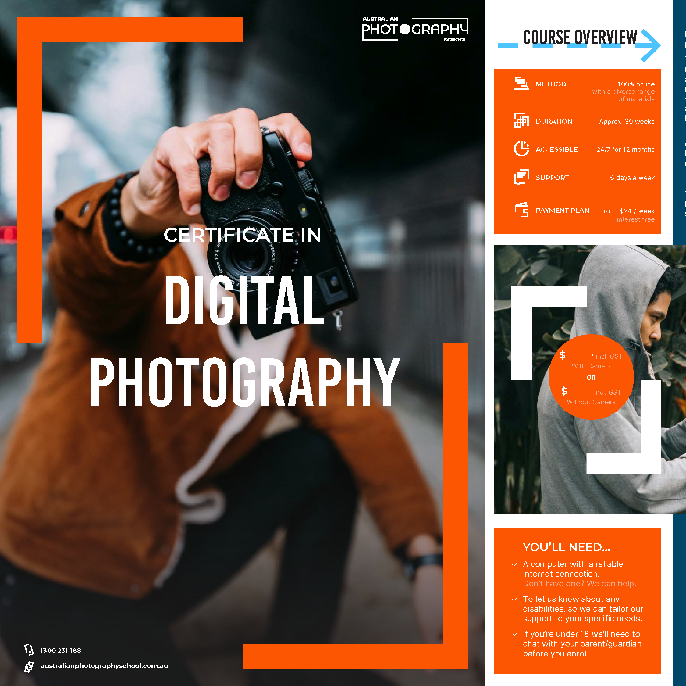
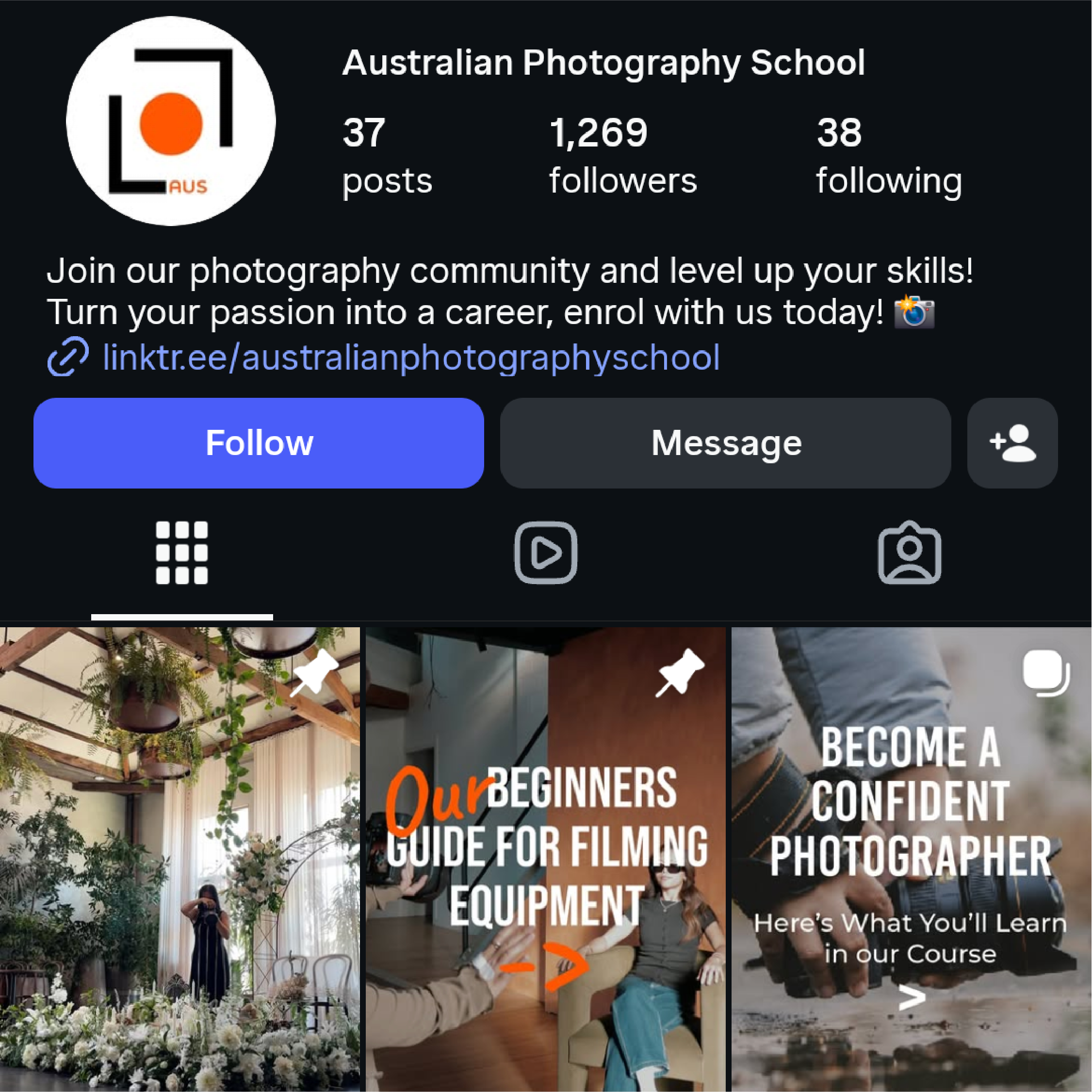
The designed brand aims to slot into Learning Online's ever-growing House of Brands to house all their courses. The logo makes reference to the shape and silhouette of a camera; the lens fitting as the second O in 'PHOTOGRAPHY'.
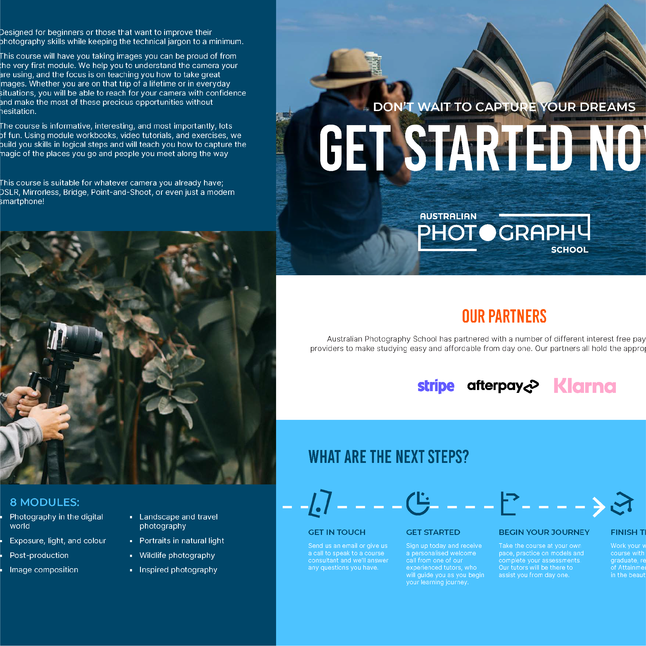
A complimentary colour scheme of orange and blue was chosen, both for its punchy attention-grabbing potential, as well as to mirror the sweeping landscapes, sunsets and sunrises that are common subjects in photography.
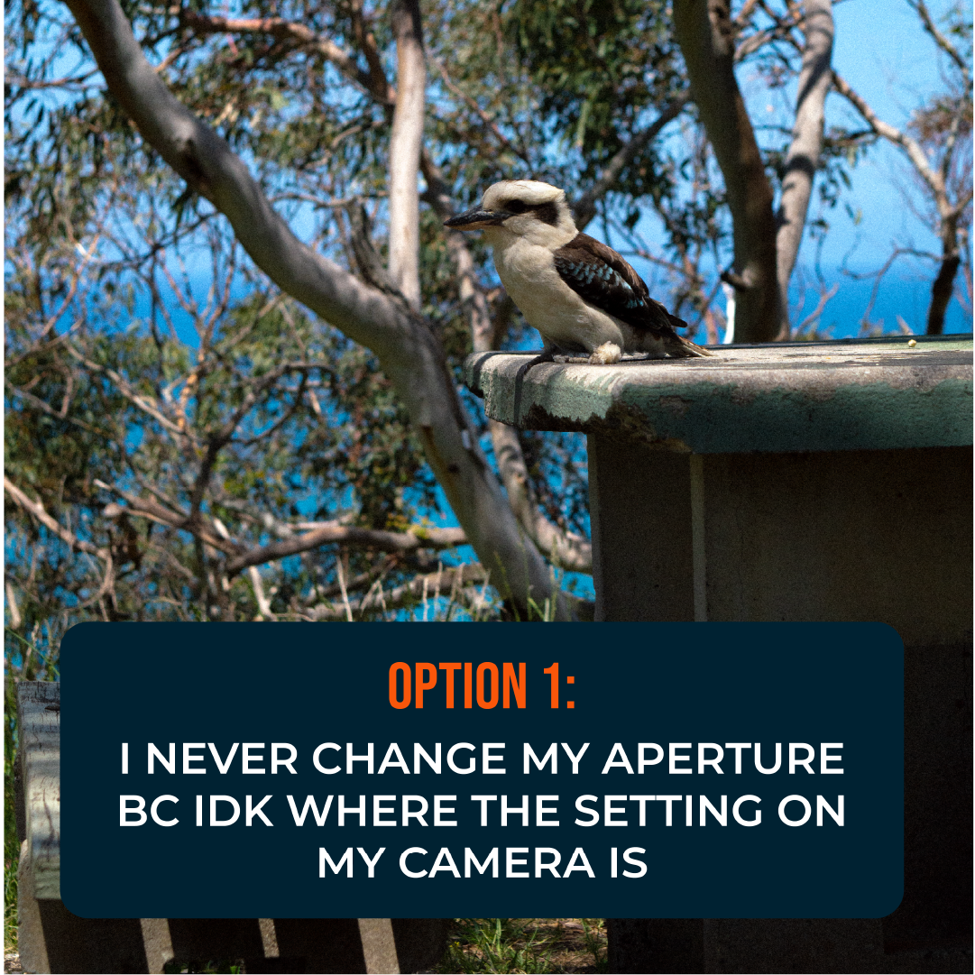
The brands imagery was also carefully selected for each region; foggy wildernesses and grand Rocky Mountains in Canada, and stunning beaches, reefs, and cityscapes for Australia. There was also care to showcase stunning photos, and to not use any drone photography; only from-the-ground shots that students would easily be able to achieve if they took the course.
Bold graphical sans-serif fonts were chosen; Bebas for strong punchy CTAs and softer, rounder, Montserrat & it's alternate forms were used to help balance out all the sharp angles.
The Photography School has launched in Canada and Australia, and is looking to expand to other countries in the future.